Brand Style Guide · Internal reference
The Always Beyond rulebook.
Colours, type, logo, components, motion, and voice — the single source every page and branded asset is built from. Jump to any section from the nav above.
Brand overview
Rallying cry
We make IT feel like a competitive advantage — not a chore.
Personality
SupportiveStrategicHumanTrustworthyCalm
Calgary-based, employee-owned MSP founded in 2024. Built to feel refreshingly different from cold, reactive IT vendors — a calm, human partner, not a ticket-counting call centre.
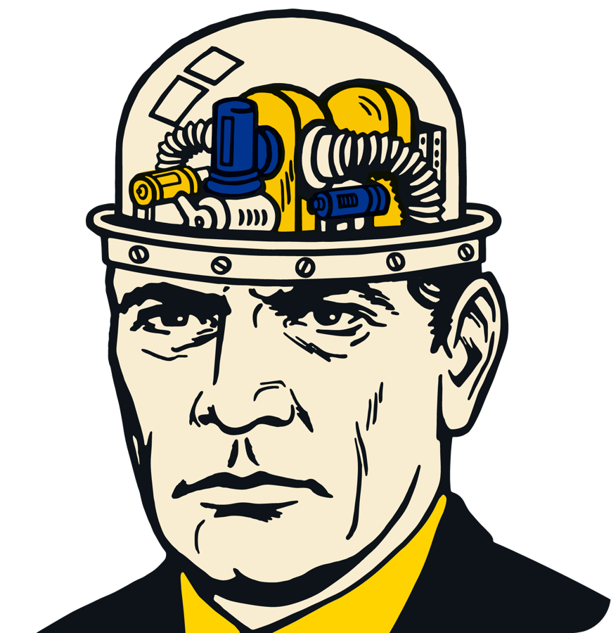
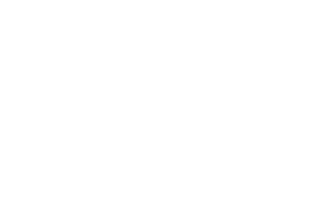
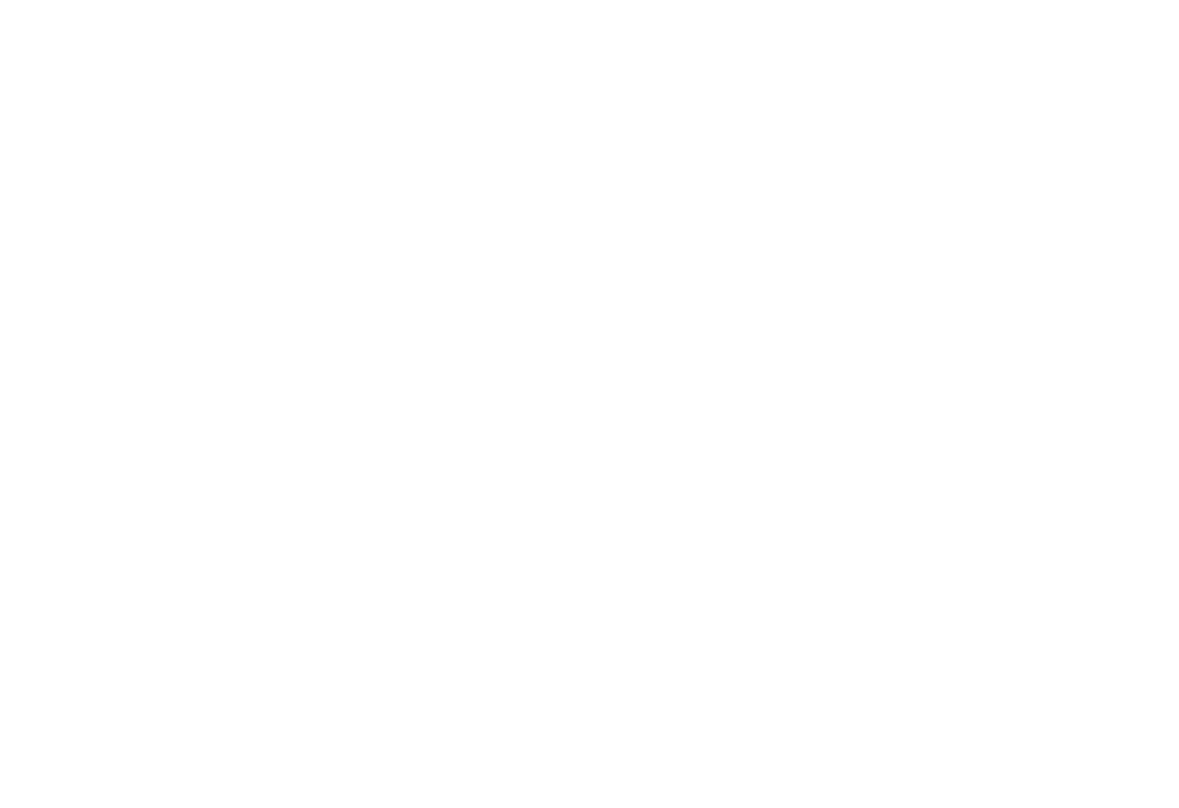
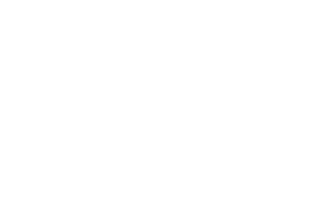
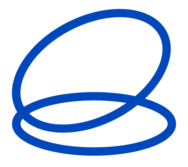
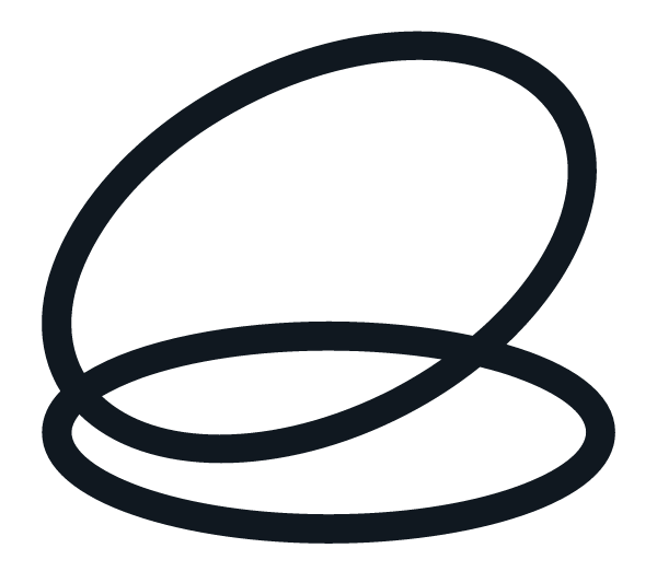
Logo
The swirl mark plus the “Always Beyond” wordmark. Three approved colourways — never recolour, stretch, or add effects. Download any variation as SVG (scalable, for design/print) or PNG (transparent, for quick use).
Full lockup
Mark only
Clear space & size
- Keep clear space ≥ the height of the swirl mark on all sides.
- Minimum width: 120px digital / 25mm print (full lockup).
- Use the mark alone only where the wordmark has appeared nearby.
Don’t
- Recolour outside the three approved colourways.
- Stretch, rotate, add shadows, gradients, or outlines.
- Place on busy imagery or low-contrast backgrounds.
Colour
The live website palette. Hex is the source of truth; OKLCH is shown for perceptual edits. Use the Tailwind token, not a raw hex, in code.
Core
#0047BBoklch(44.3% 0.193 261)bg-blue / text-bluePrimary brand. Hero & nav, links, key accents.
#FFCC33oklch(86.7% 0.165 89)bg-yellowPrimary CTA & highlights. Use sparingly for punch.
#101820oklch(20.5% 0.020 249)bg-ink / text-inkDark sections, footers & primary body text.
#FFFFFFoklch(100% 0 0)bg-whitePrimary background; text on dark.
Supporting accents
#00C6E3oklch(75.9% 0.133 213)bg-skyFresh / informational accent.
#00BB31oklch(68.8% 0.218 145)bg-greenSuccess / positive states.
#FF2024oklch(63.8% 0.248 28)bg-redErrors / urgency. Use rarely.
Neutrals & warm
#38424Coklch(37.4% 0.022 248)text-grey-darkSecondary text on light.
#97A1ACoklch(70.5% 0.020 251)grey-midMuted text, borders.
#F2F2F2oklch(96.1% 0 0)bg-grey-lightLight surfaces & cards.
#F9EDD1oklch(94.8% 0.039 88)bg-beigeWarm background accent.
Typography
One typeface across the whole brand — PolySans. Neutral (400) for regular text, Median (600) for emphasis and buttons. There is no separate display or body font. Headings H4–H6 and the Subtitle are set in uppercase.
The typeface — PolySans
PolySans Slim · 300
PolySans Neutral · 400 — regular text
PolySans Median · 600 — emphasis & buttons
PolySans Bulky · 700
Heading 1 · 60 / 42 · 1.1 · −3%
Heading 2 · 52 / 34 · 1.1 · −4% / −2%
Heading 3 · 40 / 28 · 1.15 · −3%
Heading 4 · 24 / 20 · 1.2 · uppercase
Heading 5 · 20 / 18 · 1.2 · uppercase
Heading 6 · 18 / 16 · 1.2 · uppercase
Subtitle · 48 / 30 · 1.2 · uppercase
Body 1 · 18 / 16 · 1.5 · −1%
Body 2 · 16 / 14 · 1.5 · −1%
Body 3 · 12 · 1.5 · −1%
Body 1 Bold · Median · 18 / 16
Body 2 Bold · Median · 16 / 14
Button · Median · 16 · 1.5
Each style is shown at its Desktop / Mobile size. Letter-spacing tightens from −1% on body up to −4% on Heading 2.
Form controls
Inputs and selects are fully rounded (pill); the textarea uses the 32px card radius. Two tones — one for white backgrounds, one for dark / blue. Clear labels, calm focus states, plain-language validation that explains what to fix.
On white background
So we know who we're talking to.
That email doesn't look right — mind checking it?
A sentence or two is plenty.
On dark / blue background
So we know who we're talking to.
Cards & surfaces
32px-radius surfaces with a chip, title, body, and the circular arrow button. Light is the default; blue and ink carry emphasis. No drop shadows — hover fills the arrow button. Hover a card to see it.
Support that's fast, proactive, and actually helpful.
Unlimited remote & on-site support, with people who pick up and fix it.
Security that actually protects you.
Awareness training, 24/7 monitoring, and CIS-aligned best practice.
IT that grows with you.
An 18–24 month roadmap so there are zero surprises in your budget.
Components
The reusable interactive pieces. Accordion is built on native <details> for keyboard & screen-reader support.
Chips / pill tags
Tooltip (hover / focus):
Arrow buttons — hover to fill
Arrow buttons on dark — hover to fill
Most clients pay $3,500–$7,000/month depending on team size and complexity. Per-user pricing, everything included — no surprise fees.
No. Month-to-month, cancel any time with 60 days' notice. We earn your business every month.
We handle the heavy lifting — connect with your old provider, install our tools, and pick a smooth hand-over date.
Section patterns
The repeatable layouts pages are assembled from — hero, feature grid, and stat band.
Finally, an IT company you’ll actually enjoy working with.
One package. One partner. One refreshingly different experience.
No long-term contracts · One all-inclusive package · <90-second response time
How we show up for your business
We answer calls in under 90 seconds
And the people who answer can actually fix it — often before you hang up.
We help you save dollars on tech
Cleaning up unused licences and upgrading to better, cheaper options.
You work with the same people
A dedicated Account Manager and Technical Lead who know your setup.
We help you plan and budget ahead
A tech roadmap so there are zero surprises in your budget.
99.2%
of requests rated “awesome”
90s
average response when you call
45+
growing businesses supported
Hero treatment
Our signature hero device: a photo masked into the brand oval with white chips floating over it. On load the image fades in, then the chips appear one-by-one. Reuse this on landing pages and other digital assets. Scroll it into view to play, or hit replay.
Component: HeroShowcase · mask: /assets/graphics/hero-oval-mask.svg. Pass any image + chip set; positions are Tailwind classes.
Motion
Restrained by default. Transforms + opacity only, and every primitive respects prefers-reduced-motion (reduced-motion users get a plain cross-fade). Scroll the page to replay.
Reveal — power3.out · 0.6s · 24px
StaggerIn — 0.08s stagger
CountUp — for stats
99.2%
Images
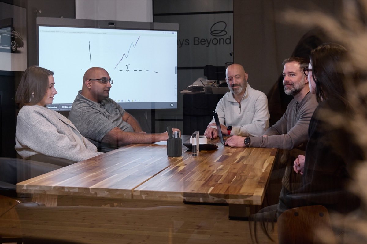
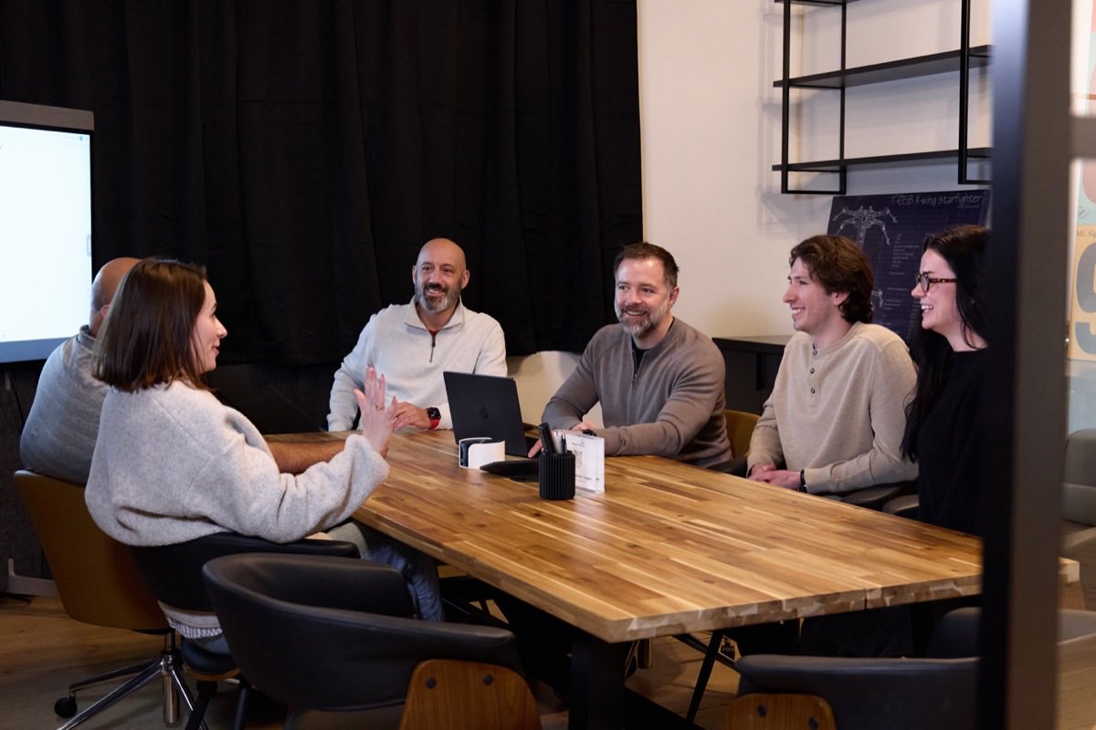
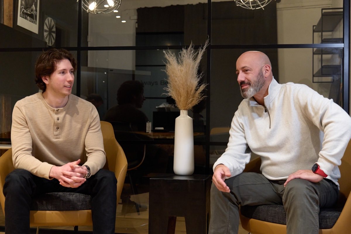
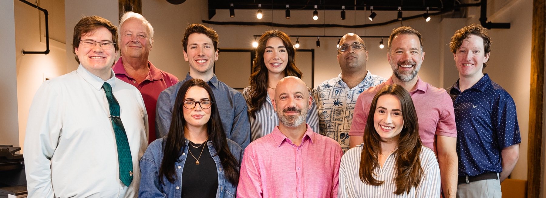
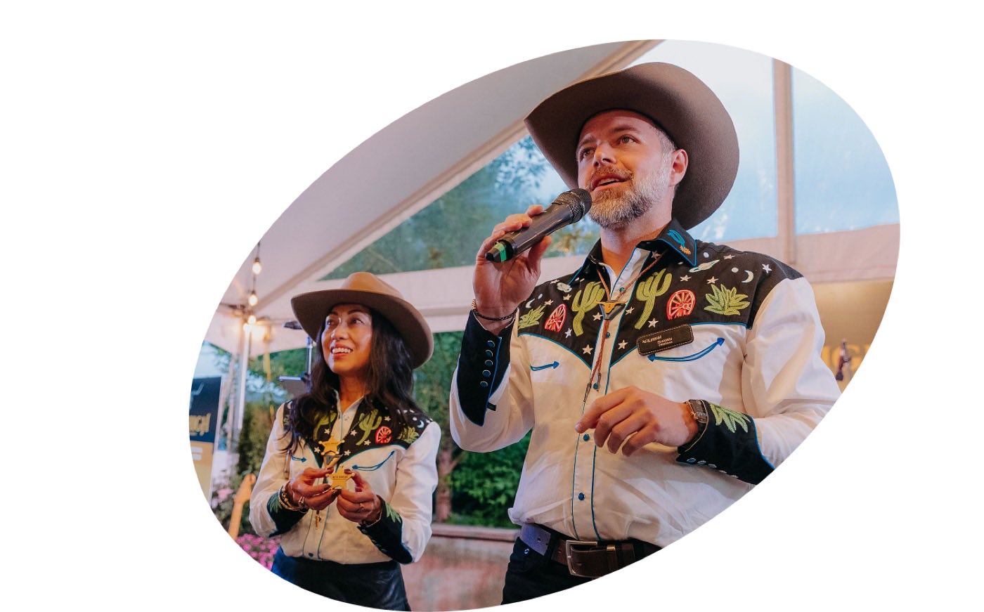
Real, warm, human photography — the team and the work, never stock-cliché. Optimised web copies live in /assets/images. Hero and section images are masked into the oval (see Hero treatment) or used full-bleed.
Team
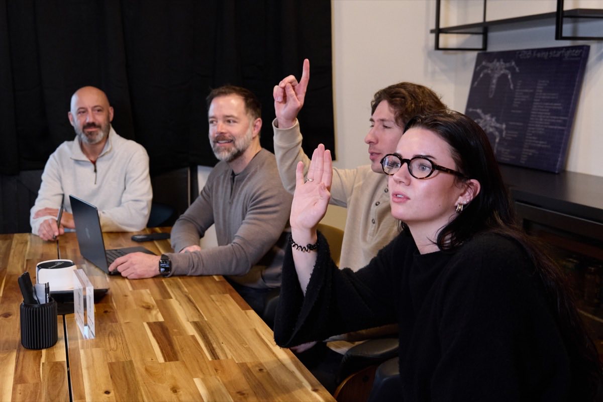
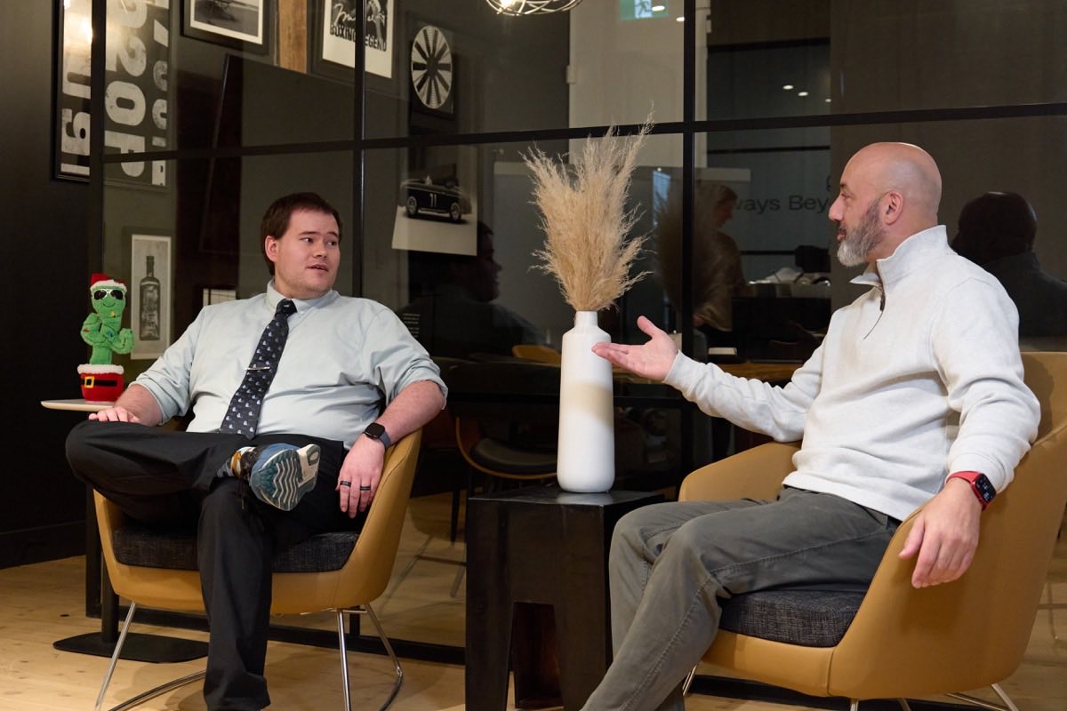
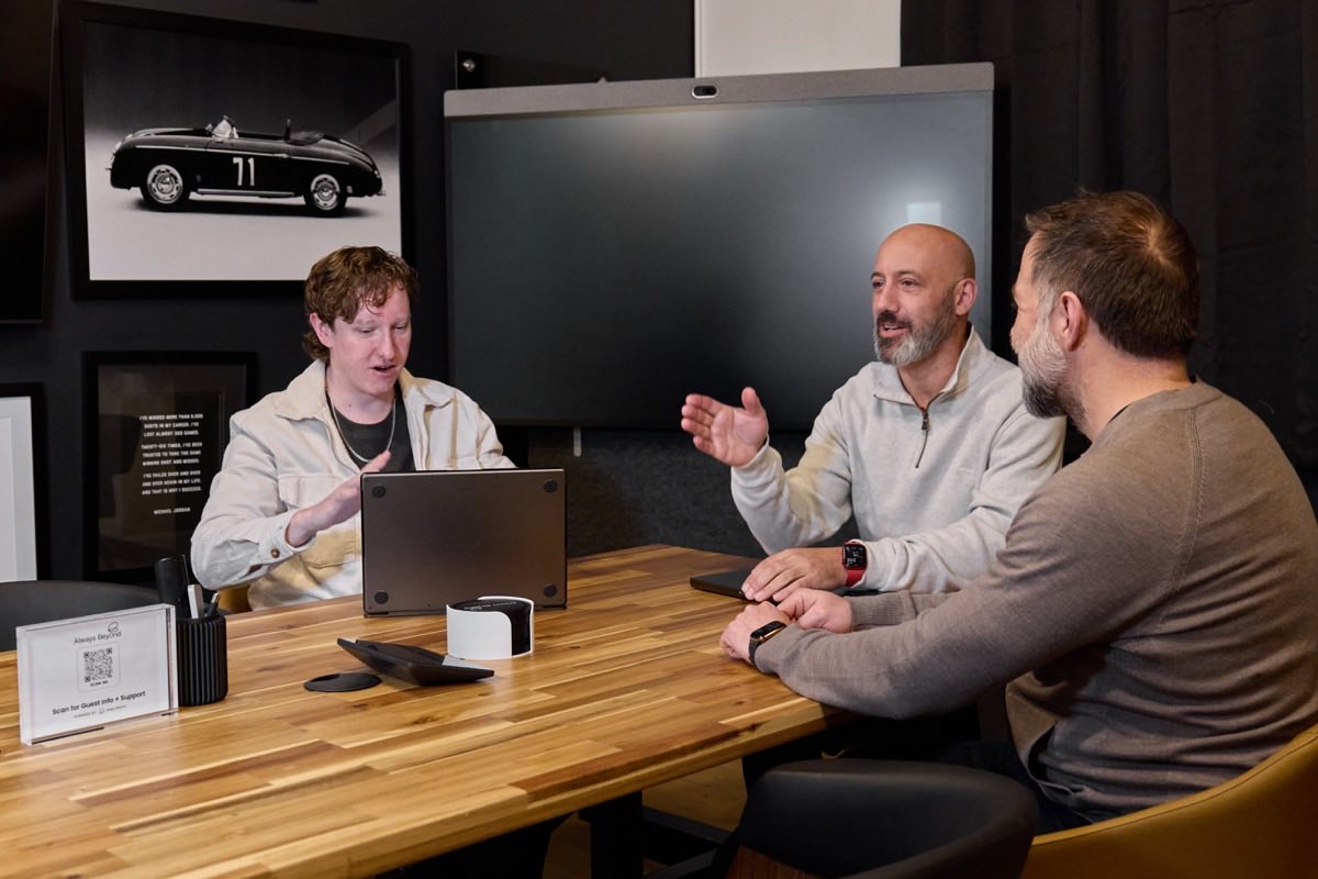
General & section
Hero & CTA

Photography ships as optimised JPG. Need a different crop or the full- resolution original? Ask Catch Digital.
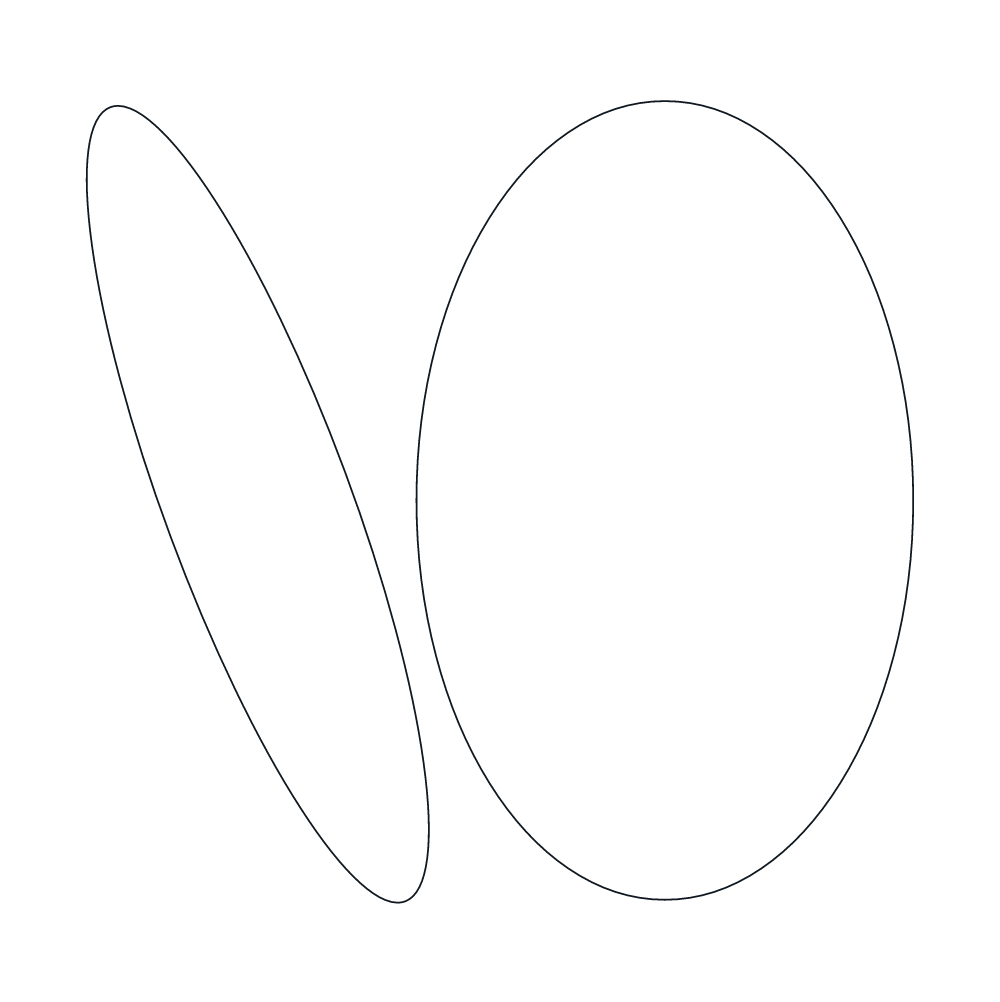
Graphics & textures
Line-art graphics used as background texture and for image treatment, plus the oval mask shape. On blue or dark backgrounds these graphics are always white — never black. Download as SVG (scalable) or PNG.


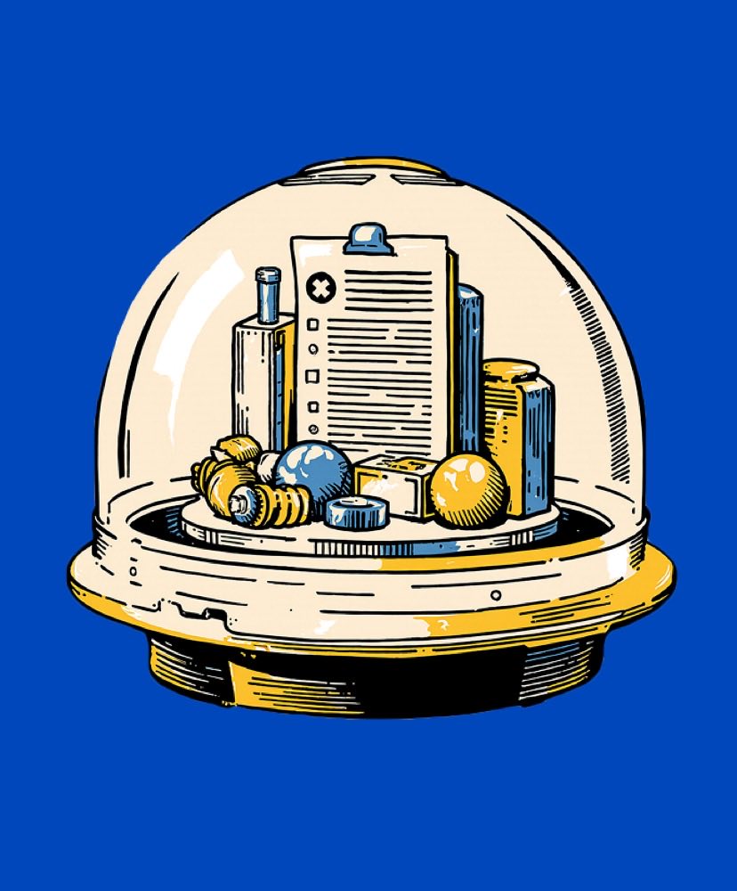
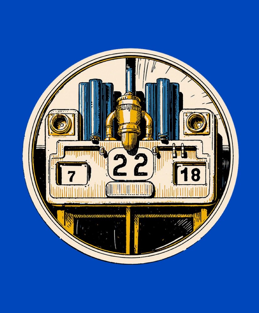
Illustrations
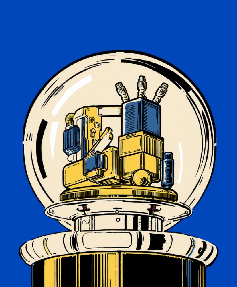
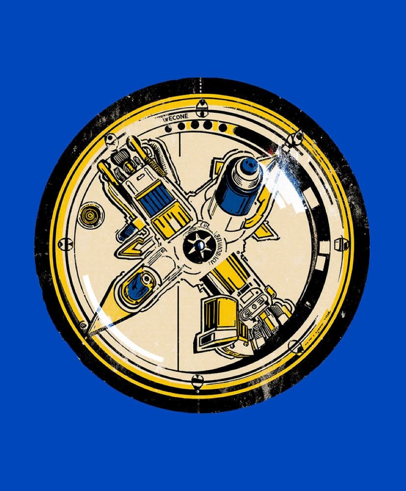
Custom illustrations (e.g. the Astral robot) used to add personality to select sections — playful, human, never clip-art. Anchor them to an edge so the crop reads intentionally; never float them centred. One illustration per view.
The Astral character anchors playful moments — headers, empty states, “about” and “community” sections. Pair with plenty of space.
↓ PNGAnimations
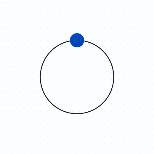
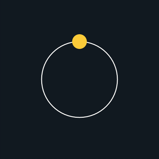
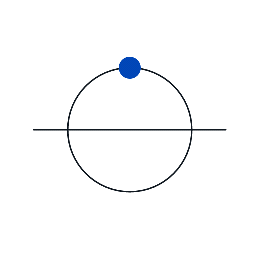
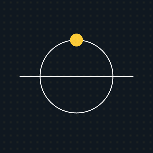
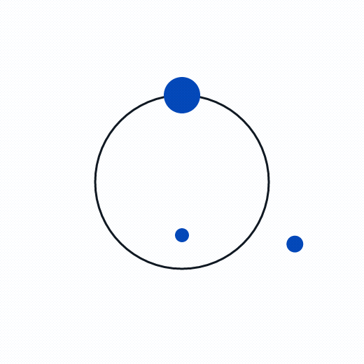
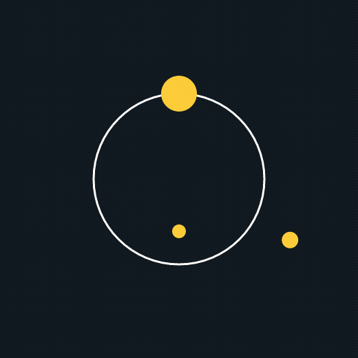
Brand motion atoms. The Astral orbit sits beside CTA copy — yellow dot on dark, blue dot on light. The header atoms accent headers and loaders, and the ticker runs as a value/number band.
Astral orbits — three motions, two colourways
Blue dot on light · yellow dot on dark. Download as MP4 (video) or GIF to drop into decks, ads, and pages.


Header atoms (on blue)

Ticker / marquee
- Human
- Trustworthy
- Proactive
- Calm
- Strategic
- Refreshingly different
A smooth, seamless CSS ticker (no GIF loop seam). The branded marquee GIFs (values, by-the-numbers, team) are also in /assets/animations.
Colour roles
What each colour means, so usage stays consistent across pages and assets.
Voice & tone
The most-used part of this guide. Always Beyond sounds like a knowledgeable peer who happens to be brilliant at IT — calm, human, refreshingly direct — never a vendor or a tech overlord. Use these rules for every PDF, ad, landing page, email, and post so the brand sounds like one voice.
In one line
We make IT feel like a competitive advantage — not a chore.
We exist to defy perceptions: proof that working with an IT provider doesn’t have to feel like a punishment. We lead with the outcome, keep it jargon-free, and stay calm under pressure.
Personality
SupportiveStrategicHumanTrustworthyCalm
Confident, not arrogant. Warm, not soft. Plain-spoken, not dumbed-down.
Tone dials
Relatable ↔ Authoritative
Both — a knowledgeable peer. Authority through clarity, not jargon.
Empathetic ↔ Neutral
Empathetic. Name the frustration, then relieve it.
Conversational ↔ Scientific
Conversational. Simplify, never dumb down.
Encouraging ↔ Matter-of-fact
Encouraging. Guide toward a better outcome.
Gentle ↔ Direct
Gentle but clear. Honest and respectful.
Calm ↔ Energising
Calm. Assure and anchor; don’t hype.
How we write
Do
- Write to one person — “you,” “we,” “let’s.” Use contractions.
- Lead with the outcome the reader cares about, not the feature.
- Keep sentences short; one idea each. Prefer plain words.
- Frame stats as human outcomes (time saved, peace of mind).
- Allow gentle, intelligent humour where it fits.
- Acknowledge a pain, then immediately offer relief.
Don’t
- Use vendor jargon or buzzwords (list below).
- Sell with fear, urgency, or shouting (“Act now!”).
- Talk down, over-explain, or drown the reader in specs.
- Be sarcastic or make jokes at the reader’s expense.
- Over-promise or use absolute claims you can’t prove.
- Stack exclamation marks or ALL-CAPS for emphasis.
Say this, not that
“We’ll handle your tech, so you can get back to work.”
“We leverage best-in-class infrastructure.”
“Security that actually protects you.”
“Enterprise-grade, mission-critical cybersecurity.”
“One package. Everything included. No surprises.”
“Flexible tiered service packages.”
“We answer in under 90 seconds — and we can usually fix it on that call.”
“Industry-leading response SLAs.”
“We fix things before you notice them.”
“Proactive, robust managed services.”
“Switching is easier than you think — we do the heavy lifting.”
“Seamless, frictionless onboarding journeys.”
“Book a no-pressure call.”
“Request a demo today — don’t miss out!”
Tone in action
Homepage hero
We say · Finally, an IT company you’ll actually enjoy working with.
Not · Innovative IT solutions for the modern enterprise.
Service description
We say · Support that’s fast, proactive, and actually helpful — the same people, every time.
Not · Comprehensive managed service offerings tailored to your needs.
Call to action
We say · See what’s included →
Not · Submit your enquiry now!
Addressing a pain point
We say · Tired of waiting on hold for someone who can’t help? Us too. We pick up and fix it.
Not · Don’t let downtime destroy your business — the threat is real.
Differentiation
We say · One package. No tiers, no upsells, no surprise invoices.
Not · We offer a uniquely differentiated value proposition.
Error / form message
We say · That email doesn’t look right — mind checking it?
Not · Error: invalid input in field 2.
Words & phrases to avoid
leverage · synergy · robust · cutting-edge · mission-critical · game-changing · best-in-class · world-class · enterprise-grade · digital transformation · seamless · revolutionary · bleeding-edge · “in today’s fast-paced world” · fear-based security clichés.
Mechanics
- Contractions: yes — they’re warmth.
- Case: sentence case for sentences; UPPERCASE only for the H4–H6/Subtitle styles.
- Punctuation: one exclamation mark at most, rarely. Em dash for asides — like this.
- Numbers: use the figure (90 seconds, 99.2%) — it’s scannable.
- Person: “you” (the reader) and “we” (Always Beyond).
By content type
Landing pages / PDFs
Lead with the outcome and a single clear CTA. One idea per section. Proof points (90s response, Hack-Free Guarantee, 99.2%) over adjectives.
Ads
Hook with the reader’s frustration or the refreshing-difference angle. Short, human, one promise. No fear, no hype.
Personal and helpful, like a note from a colleague. Calm subject lines; a low-pressure ask; never “LAST CHANCE.”
Social
Conversational and a little playful. Share wins, lessons, the team. Join conversations; don’t broadcast.
Service / product copy
Explain in plain language what it does for them. Define a term only when necessary. Outcomes first, specs second.
Support / UI microcopy
Reassuring and clear. Errors explain what to fix, kindly. Success feels like relief.
Pre-publish checklist
- ☐Sounds like a knowledgeable peer, not a vendor?
- ☐Leads with an outcome the reader cares about?
- ☐Jargon avoided or defined in plain words?
- ☐Contractions used (so it reads warm, not stiff)?
- ☐Calm and confident — not urgent, shouty, or fear-based?
- ☐CTA is low-pressure and inviting?
- ☐A moment of warmth, humour, or humanity?
- ☐Every claim is true and provable?
Implementation notes
Tokens live in tailwind.config.ts + app/globals.css. Use token names (bg-blue, text-grey-dark) — never raw hex.
Components live in components/ui; motion primitives in motion/. Import them — don’t re-create inline.
Fonts: PolySans (licensed) is served from public/fonts; Poppins via next/font. Need a new colour or component? Add it to the rulebook first, then use it.
This page is noindex and excluded from production navigation.
Maintained by Catch Digital · Keep current with alwaysbeyond.com